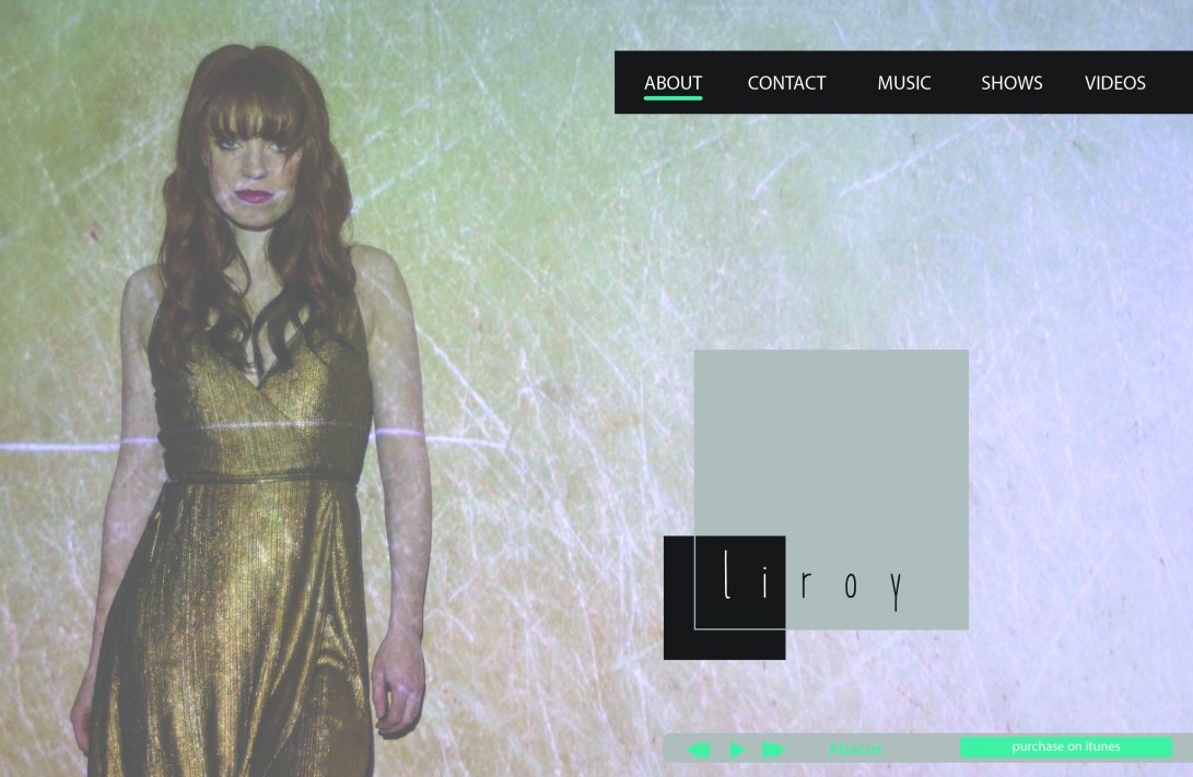
I had a very exciting opportunity while living in Canada to work with the up and coming musician, Liroy. During my time working with her, I developed her logo, brand style, photography, digital single art and some flyers for concerts on her UK & Irish Tour.
Liory is passionate about cutting down on the waste that we create, with that in mind I developed the logo in a black and white contemporary style. This would allow her to save on production costs, and also cut back on inks used in any print material that she would use. This approach was not only more environmentally friendly than a full colour logo, but also cost effective for Liroy.
![]()
The approach to Liroy’s photoshoot, was done with the use of a projector in my studio.
I manipulated textures and then projected them onto Liroy. The shoot was developed with future advertising in mind, with the intent to allow these images be used in all aspects of her promotion. Adequate space was allowed to later enter information, samples of this can been seen further below.
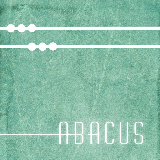
Abacus art work is a digital single cover that I produced for Liroy, for the release of her track, Abacus.
The lyrics of the song have an underlying tone of destruction, which was conveyed through the grungy texture. The song itself is crispy and clean which is suggested by the clean customised logotype and colours used..
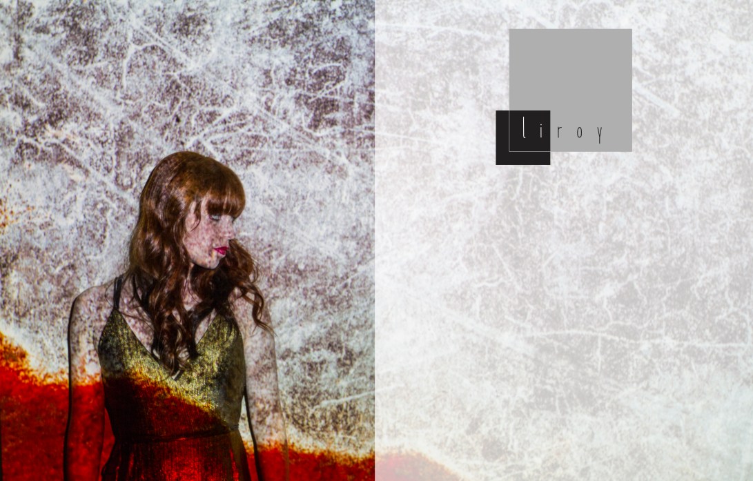
I created some sample templates that Liroy could use later for self promotion.
This would allow Liroy to add in information for upcoming shows and appearances.
Below is the landing page I created for Liroys website.