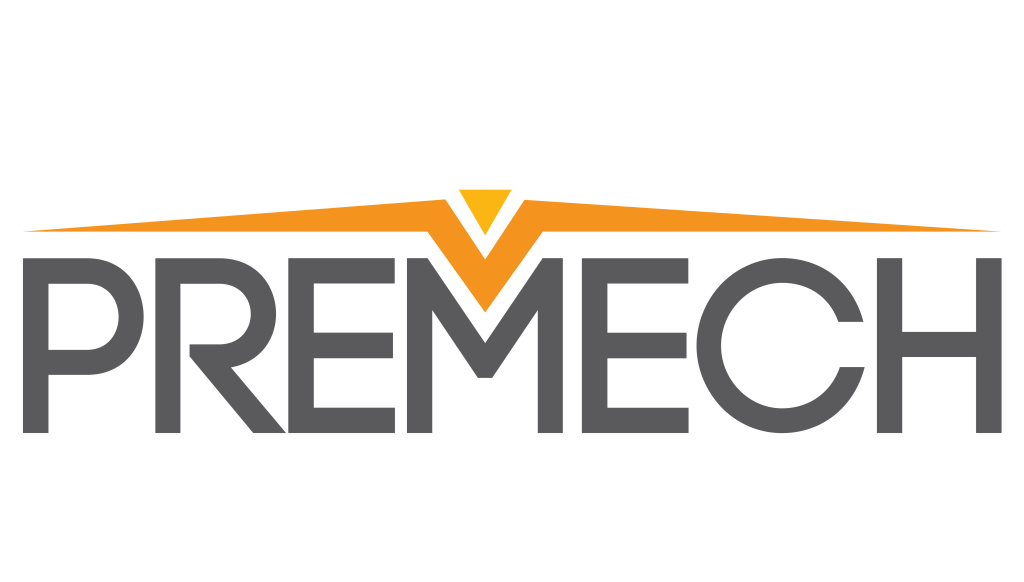
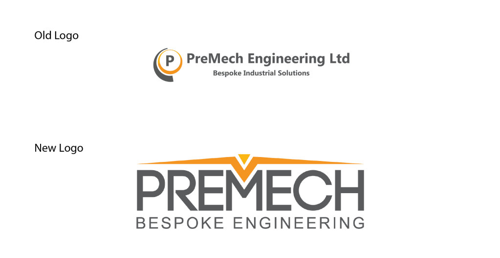
I was approached by Premech Bespoke Engineering who specialise in the fabrication of clean room equipment for Pharmaceutical companies, to redevelop their logo while retaining their brand colours.
The Directors at Premech wished to retain a logotype approach but were open to some additions if it reinforced their brand.
I developed some concepts and this one quickly took the lead for its strong presence, minimalist style and incorporating a tool that they use in the fabrication of products for their consumers, A Brake Press.
This Logo has become a mainstay of their business as they expand to more clients, and reinforces their brand and customer promise of delivering high quality products with its clean, sharp and minimal feel.
https://premech.ie
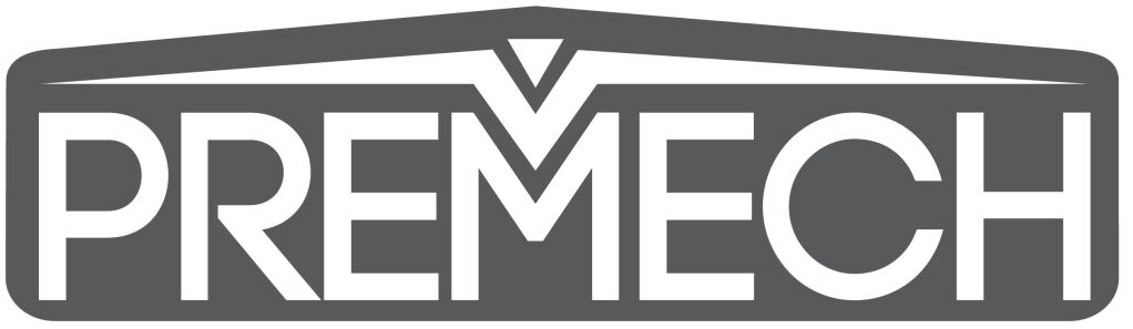
The Logo was also designed for use without the tagline, as seen below, and a version that would be used for laser etching onto their products.